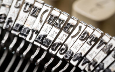
Though many designers will know the difference between ‘typeface’ and ‘font’, they may struggle to grasp how the different mechanics of typography can translate into making a good choice for business advertising. It is more than merely selecting a font family that looks good to the reader; you are choosing a core component of the user interface. How does a promo printer capture a business’ essence and style in a set of characters?
Here are a few tips:
Understand the big picture
Before initiating the process of scanning font libraries, it’s important to have a comprehensive understanding of the purpose of the experience being designed. The message being conveyed will inform the typeface, not vice versa. The graphic design service London businesses deserve will be able to create something that commands attention and screams originality. It can be helpful to jot down a few descriptors of a company voice/mission to act as a guideline for the typeface selection. Words like ‘playful’, ‘luxurious’ or ‘bold’ can be identifying characteristics of a typeface aesthetic that matches a company.
The 3 key criteria
The 3 main boxes your typeface need to tick are legibility, readability and versatility. These all add up to overall usability, and utility is the foundation of a good typeface choice.
Legibility
It is likely that legibility and readability will be interchangeable to the average reader, but a printer for a graphic design business will understand these two different properties of the text. Legibility is a measure of how easy it is for the reader to distinguish individual characters of text. Contrast, kerning, lowercase or uppercase – these are all things to think about, while as a general rule serif typefaces are considered more legible than sans serif. The I/l/1 test is a good way to test legibility.
Readability
This is a measure of how well text can be discerned, but refers to the overall digestibility of content. Readability is about the bigger picture. Unjustified is more readable than justified, and you can test readability by asking random people if they can read your typeface easily.
Versatility
Your advertising will have a visual hierarchy, and the typeface must be versatile enough to match with different weights and styles. The most versatile ‘workhorse fonts’ include Arial, Georgia, Franklin, Roboto, Gothic, etc. They are useful for content-heavy experiences, but aren’t the most creative of solutions. If your typeface lacks a little flexibility, you can combine different ones to add versatility. This can result in some unique aesthetics, but not all combinations will work.
Ultimately, the best typeface for your advertising really depends on your specific needs. But by following these tried-and-tested best practices, you maximise your chances of success. Whether you require large format printing or something smaller, it is a good idea to consult the experts before settling on a final decision. Contact Promoworx and let us help you get your advertising material looking its best.


