With Promoworx 5th Birthday coming up on June 19th, we thought we’d celebrate with £5 gift vouchers, 5 types of cake, our 5 favourite things over 5 different days. Hmm, sensing a theme?
So as we are into the last 5 working days before our birthday (are you excited? we’re excited!) we thought we’d get going on the countdown of our 5 lists, of our ‘5 favourite’ things, over the next 5 days. Phew, that’s a lot of 5’s.
First up! Our 5 favourite fonts. When you work in design and print as long as we have, you grow oddly attached to layout’s, print processes and fonts. We thought we’d divulge in our favourite fonts which could also provide you with some needed inspiration, and move you away from the likes of arial and comic sans. No comic sans, no!

1) Helvetica
The basic font every Graphic Designer loves, it’s simple, clean and classic, and best of all? It’s not Arial!
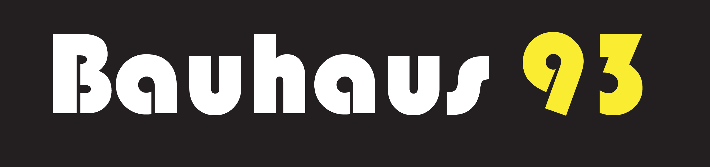
2) Bauhaus 93
Our Print Manager Jimmy’s fave, something bold and different!

3) Sketch Block
Kate ‘Boss Lady’s’ Fave. While her favourite tends to change every week, she loves this one right now. It’s on our current canvas print promotions!

4) Frutiger
Our Swedish Graphic Designer Jenny would much rather list the ones that she doesn’t like, but if she had to hang out with only one font for the rest of her life it would definitely be Frutiger, the lower case a’s are just so sexy!

5) Ostrich Sans Bold
Our resident Canadian Natasha love’s this font, it’s a font that can be both classic and conservative but can be edgy and artsy too. Who say’s a font has to be one or the other, why not combine classic shic-ness with a modern edgy twist!